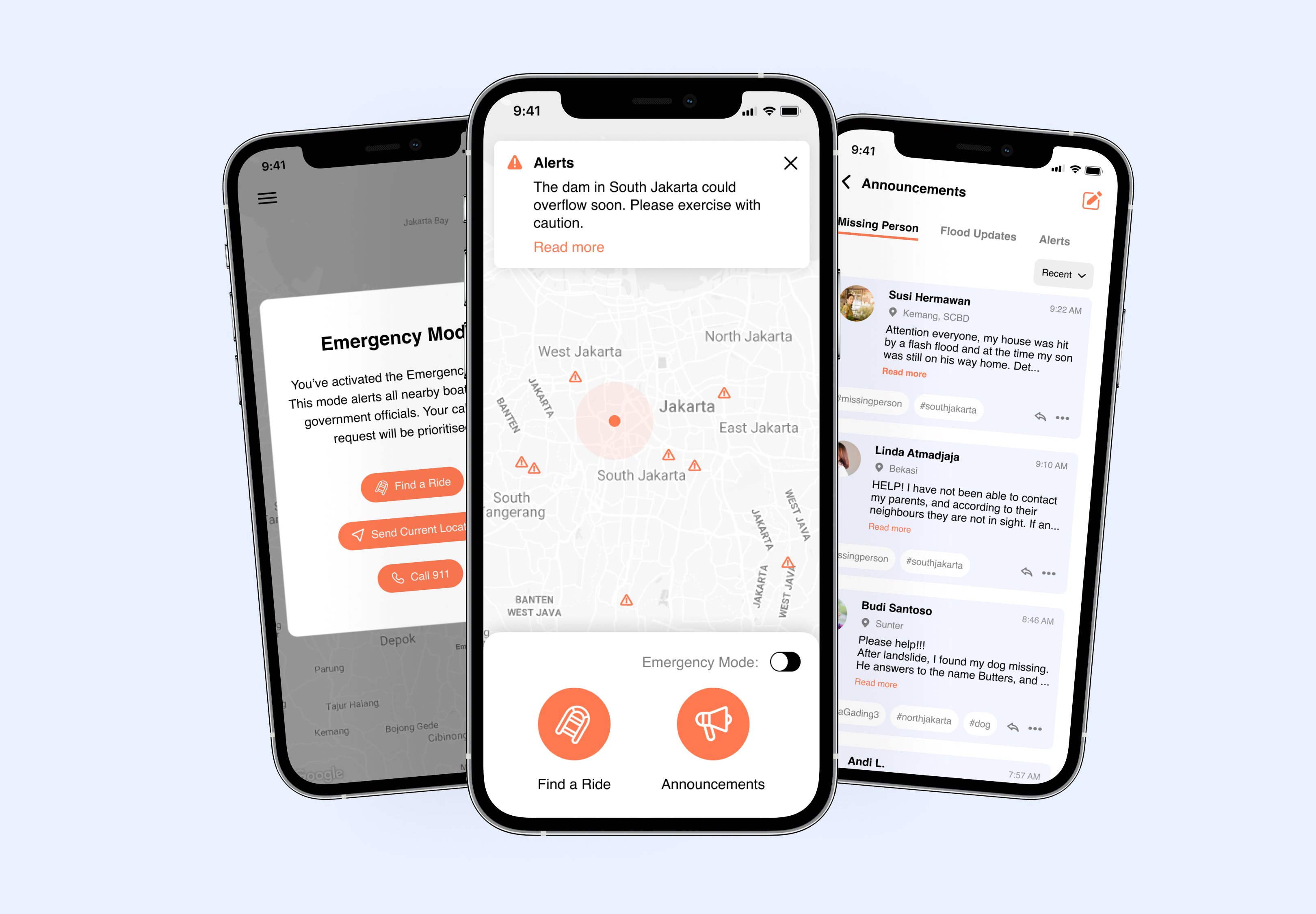
Data visualization tool for Olive

Empowering analysts to uncover deeper insights into their data and make better informed decisions.

Duration
3 months
Role
1 CTO + myself
Skills
User Interface, User Experience, Research, User Testing

Looking at data all day can be tough..

However, this is the norm for many analysts and businesses when acquiring software. While Olive helps streamlines the software procurement process, users typically focus only on summary results, rather than the comprehensive data that is offered by Olive.

How might we boost user engagement and maximize the presented data on Olive?

↪ jump to solutions
Context

What is Olive?

Olive is a platform that streamlines businesses' process of buying a software. They provide information about the software, then evaluate it against the requirements that each company has. Olive believes that this removes any biases and ensures personalized and focused results.

Identifying the problem

Solutions provided by competitors are biased and not personalized

To understand the problem scope better, I conducted a competitive research analysis on softwares similar to Olive. I focused on their features and solutions they offer to their users.

From this analysis, it became evident that the information provided by these software solutions is generic and lacks customization for each company's needs. Furthermore, competitors often rely on reviews provided by current customers with disparate requirements.

User research

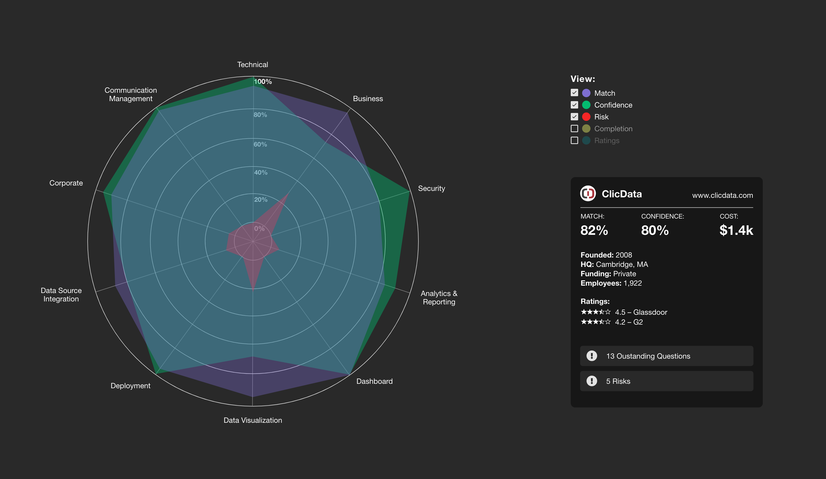
Olive users believe data visualizations enhance interaction and engagement.

I conducted user interviews with Olive's users and target users to understand more about their experiences when using Olive, and their pain points.

Key Takeaways:

Synthesis

Narrowing down UX parameters

Utilizing insights from the user interview, I crafted a persona: a proficient business consultant/analyst aspiring to be the problem-solving expert. Nonetheless, this persona encounters daily hurdles in effectively analyzing spreadsheets and making informed decisions.

I created 3 main pain points and its respective solutions:

Design

Designing data visualization

With the persona in place, I initiated the ideation phase by sketching various data visualization concepts on paper. During this stage, I maintained open communication with the CTO, incorporating internal feedback to ensure alignment with their expectations and branding guidelines.

Here are some examples of sketches and the key screens:

After obtaining a clearer vision of the data visualizations, I charted the flows of the entire platform, with a particular focus on how users would navigate between different visualizations. This process not only helped me conceptualize other necessary components but also facilitated the creation of the overall user experience.

Usability testing

Testing and validation

I created a clickable prototype on Figma, and conducted a remote usability test. During the sessions, I prepared series of questions and challenges I'd like them to do with the prototype. This way, I was able to evaluate how well users could navigate throughout the page and see if the designs provided would be effective.

60% of users expressed strong interest in using the new feature regularly

Moreover, 100% of them also agreed that they would be able to learn these new features quickly.

"I'm a visual person – love seeing the data visualizations! These help me present easily to my stakeholders when coming to a software decision"

– Olive customer and business analyst
Iterations

Despite the great results, there are some things I needed to change...

Here are some of the iterations I made, following the usability test sessions.

A change in the way we highlight differences

One of the features users loved was the ability to expand graphs to highlight differences between each software solutions. However, during the usability test, many of them are not aware of this feature.

Solution:
Instead of clicking onto the numbers to expand the graph, the grids are highlighted upon hover, indicating that it is clickable.

Adding a step-by-step onboarding

From the test, 60% agree that they feel confident using the platform*
*... Confidence will increase after several uses of the platform.

Solution:
I designed a step-by-step tooltip upon onboarding and trying out the new feature. Most people are already familiar with this format, hence increasing its chance of success.

Final design

Here are the final designs

The final solution of this project can be divided into three main sections:

Challenge 1: Differentiate each software solutions

Highlighting differences in two ways

Compare and contrast
Customers can easily compare software solutions across categories, requirements, stakeholders, and departments through intuitive data visualizations.

Expanding Grids
When multiple software solutions share similarities, expanding the grids helps users recognize that, despite commonalities, each solution excels in distinct areas.

Challenge 2: The data within the spreadsheet lacks engagement

Interactive data visualization

Users can now choose from three distinct, customizable data visualizations. Each can be tailored to specific requirements using filters, grouping, and measurement options, making the data more engaging and insightful.

Challenge 3: Making informed software decision

Increasing data visibility

Beyond streamlining spreadsheets, these visualizations reveal additional factors and measurements that may influence decision-making—elements that are not immediately evident in raw spreadsheet data.

Reflections

Importance of research and usability testing

Being unfamiliar with software selection, this project initially felt challenging. This led me to place immense importance on the research phase, striving to deeply understand the issue's scope and empathize with users. Here, I also learned to plan impactful usability tests – from participant outreach and scheduling to defining objectives and success measures.

What would I do differently?

While working on this project, I initially embraced a blue-sky mindset to foster creative thinking. Looking back, I've realized the importance of maintaining a balance between creativity and practicality. In future projects, I aim to apply this lesson by actively collaborating with developers to ensure a more seamless transition from design to implementation

Above is the screenshot of Olive's website, with a snippet of one of the data visualizations I designed in their software.
Learn more about Olive here.

Related work:

Ride-hailing app during a flood disaster

Helping Indonesian flood victims get to safety through community efforts.