1. AI-Assisted Invoice Submission Tool
In 2023/24 alone, the Financial and Administrative branch processed over 12,200 direct invoices for the ministry. The existing submission process relied heavily on manual coding sheets, creating multiple points of failure - from incorrect service provider information to coding errors triggered by policy misinterpretation. Each invoice required approximately 8-17 minutes of manual entry, verification, filing and archiving.
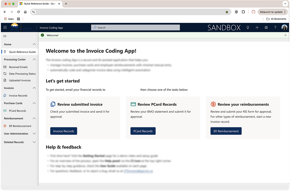
I led the UX and research for an AI-assisted submission tool designed to reduce manual efforts while maintaining complex financial compliance. Through 7 usability test sessions and workflow mappings, I identified that the primary breakdown wasn't just interface friction. Instead, it was the lack of clarity and cognitive burden of interpreting financial policy while performing repetitive data entry.
Efficiency at scale
The redesign focused on restructuring the homepage to provide clear instructions, expectations and strong call-to-action. I simplified the overall workflow, added contextual descriptions where ambiguity previously existed, and reduced unnecessary decision points. Most significantly, the new system leverages AI to automatically read and extract information from submitted invoices --> removing the need for staff to manually input detailed financial data.
I collaborated closely with product owner, developers and stakeholders to ensure the automation aligned with government requirements, while re-aligning the experience to the BC Government Design System and auditing for accessibility maturity.
From 8-17 minutes --> 1-2 minutes per invoice
70-90% projected reduction in operational handling time
The redesigned tool will significantly reduce correction cycles and manual processing effort. At scale, even small time saved per invoice translate into hundreds of staff hours regained annually, while improving accuracy and confidence in first-time submissions.
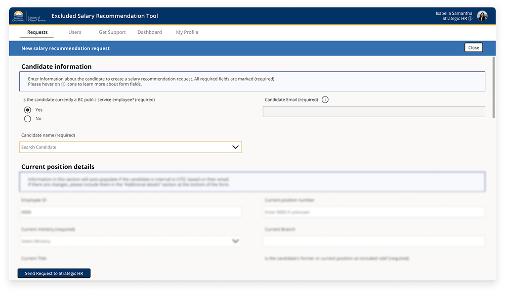
2. Salary Calculation Tool & Accessibility Maturity
Salary recommendations were previously calculated through decentralized, manual processes. Each ministry interpreted compensation guidelines independently, often relying on spreadsheets and policy cross-referencing. This created inconsistencies, gaps in trust, and lack of transparency across services.
The process of creating a salary recommendation could extend up to 4 days. In some cases, delays at this stage could risk losing candidates if offers were not delivered quickly and confidently. Within a single ministry alone, there can be 45-50 salary requests per quarter, making inefficiencies highly visible at scale.
I led the end-to-end UX design of a centralized salary calculation tool built within Microsoft Power Apps. The goal was not only to reduce processing time, but to create a more seamless experience and equitable approach to salary recommendation.
Centralization, speed & equity
We conducted two rounds of usability testing with 8 participants in total. We mapped service journey flows, identified friction points in edge cases and possible solutions. Based on our UX research, we simplified the workflow into a guided, structured experience that removes the need for manual spreadsheet calculations and automated salary recommendations.
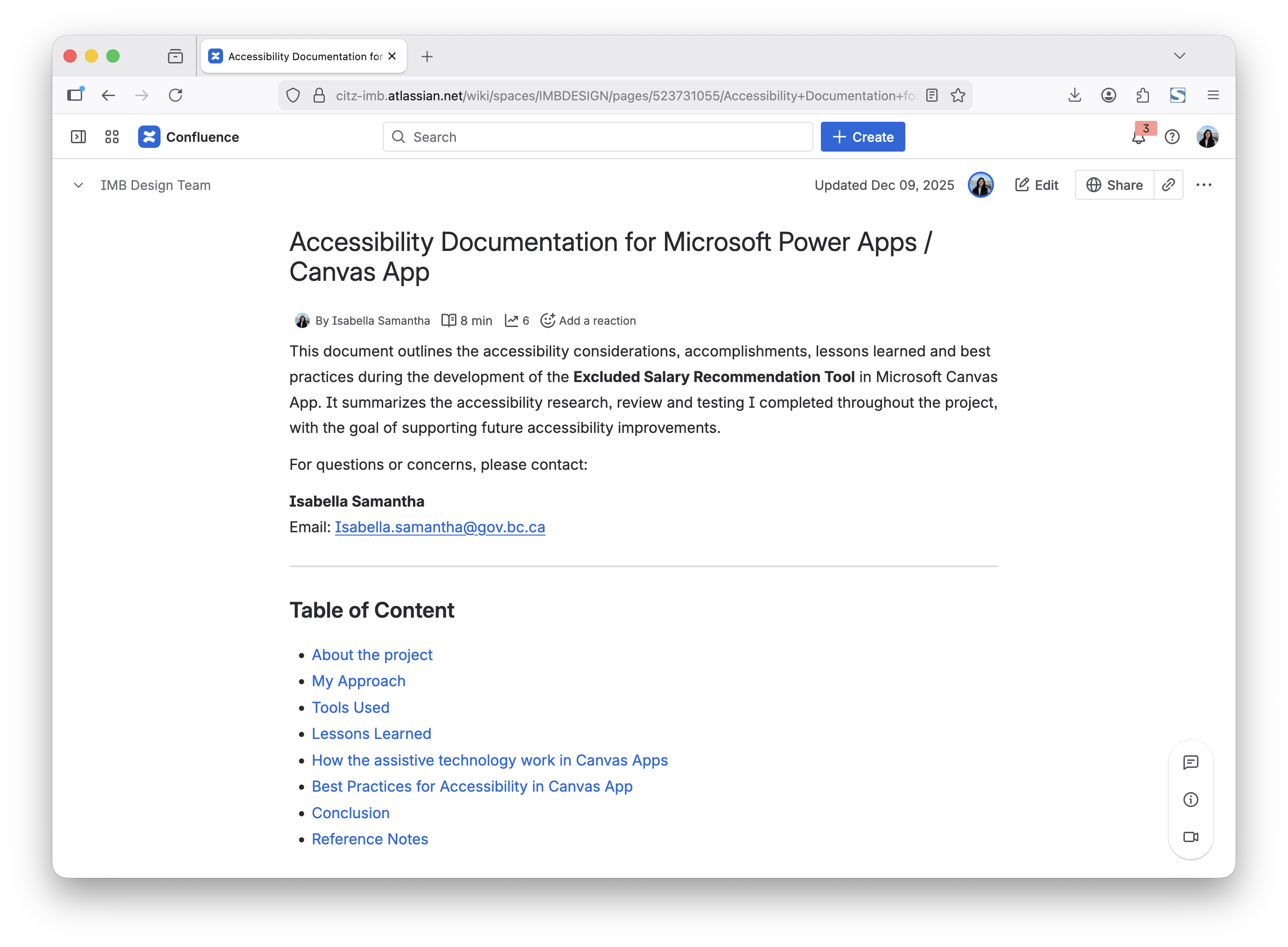
Additionally, I audited over 200 components for accessibility, and conducted usability testing with assistive technology user. From this, I developed accessibility guidelines to support long-term enterprise scalability.
From 4 days --> 1 day processing time, per salary recommendation
By consolidating the complex salary recommendation workflows into a single, structured tool, this initiatives aims to improve turnaround time, strengthen consistency across government, and increases confidence in compensation decisions - reducing both operational friction and candidate attrition risk.

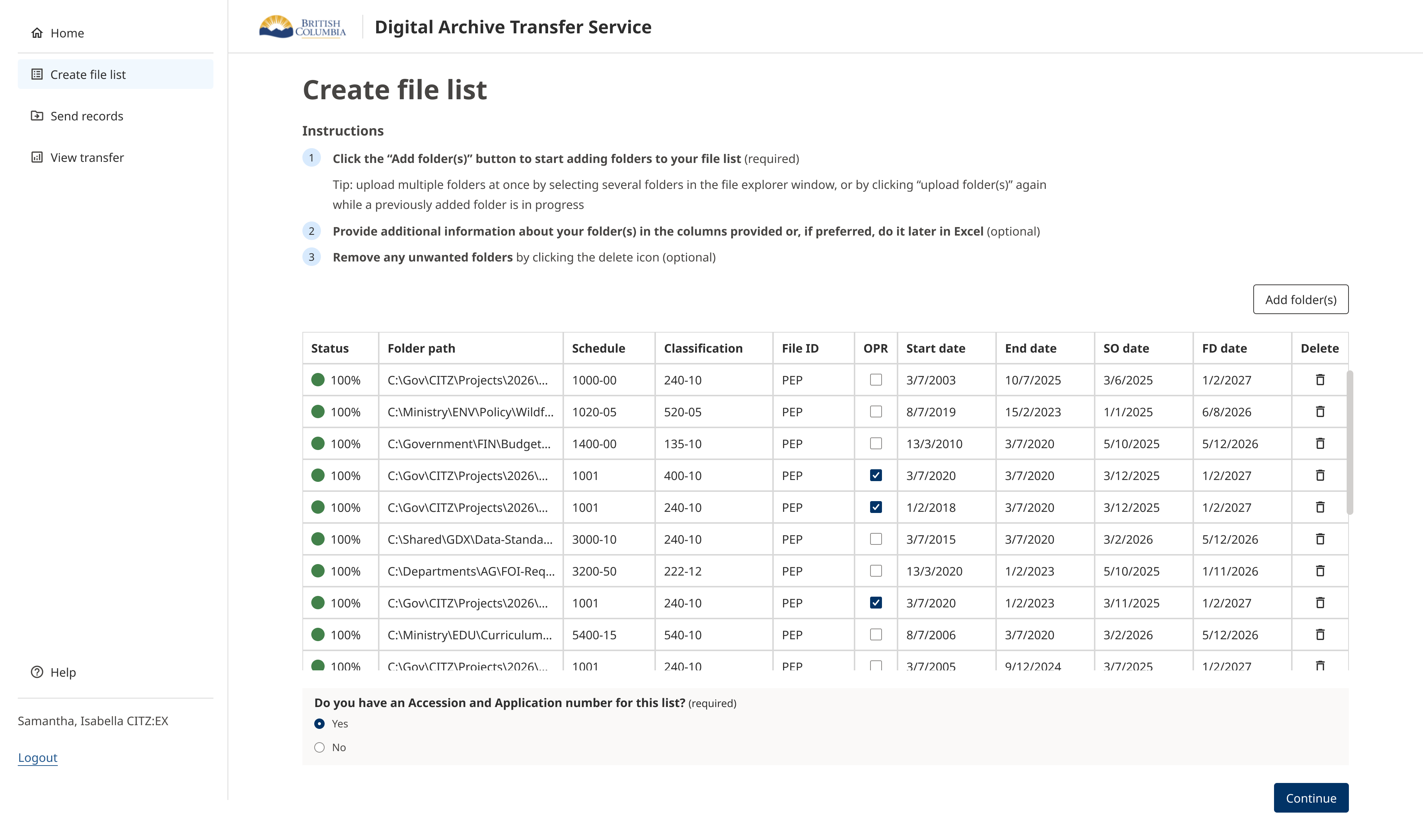
3. Digital Archive Tool & Public Search Experience
Archivists were managing records through tools that made accurate metadata entry and compliance validation difficult and inconsistent. At the same time, citizens required a reliable and intuitive way to search and access archived records. The challenge was designing for two distinct user groups — internal specialists navigating detailed archival standards, and the general public seeking accessible information.
I led the UX design across both the internal archiving workflow and the public-facing search experience. Through workflow mapping and usability testing with government archivists, I identified friction in metadata input, validation logic, and error handling that increased the risk of incomplete or inconsistent records.

Internal Efficiency & Public Transparency
The redesign streamlined metadata entry into a more structured and guided process, reducing ambiguity and improving validation clarity. For the public experience, I designed a simplified search interface that balanced discoverability with technical constraints, ensuring citizens could navigate archival records without specialist knowledge. Both experiences were aligned to the BC Government Design System to ensure accessibility, consistency, and long-term scalability.
